COLORIST
A Film and TV Colorist obsessed with the art and science of color grading.
WHATISACOLORIST?
A colorist is a storyteller.
We take raw, beautiful footage and shape its tone, emotion, and rhythm through color. It’s not just about making shots look good, it’s about supporting the director’s vision, crafting a feeling of a particular scene, and adding an element to the story you never knew existed.
It's this...
THEARTOFCOLOR
Color for film is a language and an artfrom of its own. It can evoke emotion, create atmosphere, and even tell a story. A colorist uses color to enhance the narrative, guiding the audience's emotional journey through the film. In the hands of a skilled colorist, it changes the feeling you get from a scene, the way you feel about a character, and even the way you remember a film. Wes Anderson, for example, uses color to create a sense of nostalgia and whimsy in his films. The muted pastels and warm tones in "Moonrise Kingdom" evoke a sense of innocence and childhood wonder, while the bold colors in "The Grand Budapest Hotel" create a sense of opulence and grandeur. "Asteroid City" goes even further, using color to create a sense of otherworldliness and surrealism.
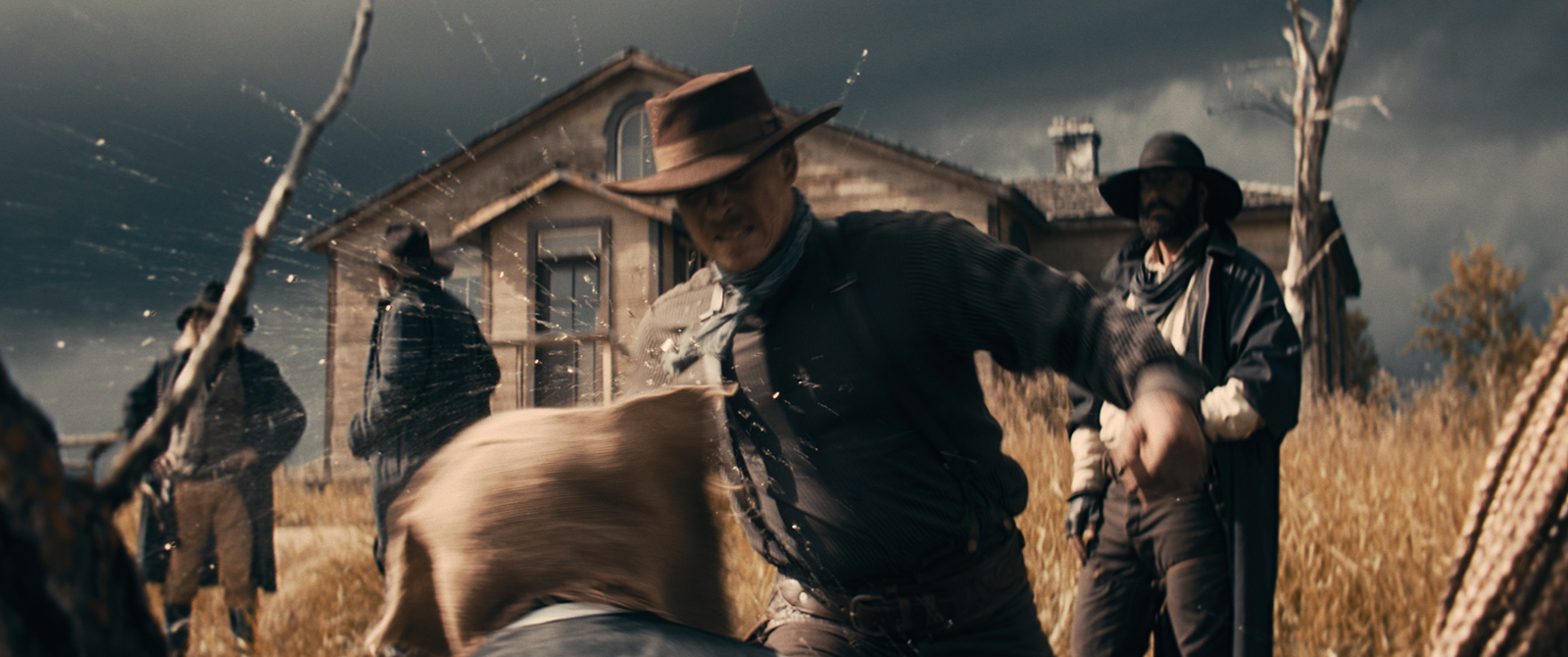
It is art. In the example below from a film called "One Click", I wanted create an old west vibe, something you'd see in an old photograph from the late 1800s. I changed the color of the green grass to give the image a warm, nostalgic feel, while darkening the clouds to make them feel more ominous, like the gang in the film. The result is an image that feels both timeless and contemporary, evoking a sense of nostalgia and dread, while still feeling fresh and modern.
PRACTICALCOLOR
I wouldn't color grade a film, set in the 1800s, the same way I would a commercial. They have different audiences and different stories to tell. The grade on the frame below, for a commercial client, was about presenting a look that reflected the brand and what they were promoting. Making sure the colors are consistent across shots, matching skin tones, and ensuring that the final product looks good on all screens. So while color can be creative, it must also be practical.
THE SCIENCE OF COLOR
When I first started color, let's be honest, I didn't know what I was doing. I was just playing with the colors and hoping for the best, using my eye to decide if it was good r not. The monitor wasn't calibrated, the lights in the room didn't matter, it was a literal shot in the dark.
Then came one of my first films for theaters and everything changed for me. I graded as I would normally, but when I sat in the seat to watch the film, I was horrified. The colors were all wrong. The blacks and highlights were all over the place. Colors were off. It was the moment I knew I needed to know about the science behind a great color grade.
ACES HAS ENTERED THE CHAT
Today I color grade almost everything in ACES.
ACES (Academy Color Encoding System) is the workflow for projects that need a high level of color accuracy and future-proofing. Developed by the Academy of Motion Picture Arts and Sciences, ACES is a standardized color pipeline designed to maintain consistent color from capture to final delivery — no matter the camera, format, or screen. Why does that matter? Because your project should look its best everywhere — in theaters, on streaming platforms, your device. ACES gives me the flexibility and control to preserve the full dynamic range of your footage and push the creative grade without sacrificing technical integrity. It also ensures easy back and forth when collaborating across VFX, editorial, and post. ACES helps me protect your image from set to screen.
REC.709
Trusted friend, Rec. 709
Rec. 709 is the standard color space for most TV, web, and streaming content. I use it when a project is meant to be delivered in standard HD and viewed on regular screens, which is still the majority of content out there. It’s reliable, familiar, and great for projects that don’t need the extra range or complexity of something like ACES. It also means faster workflows and fewer surprises in post, especially when you know exactly where your audience will be watching. Clean, efficient, and still beautiful when done right.
CALIBRATION, REFERENCE MONITORS, SOFTWARE
For science, of course.
I use a reference monitor to ensure that the colors I’m seeing are accurate and true to life. It’s a calibrated monitor that displays colors as they should be, so I can trust what I’m seeing. This is crucial for color grading, as it allows me to make precise adjustments and ensure that the final product looks great on all screens. The monitor is factory calibrated...it's not a consumer or prosumer it's built and designed for color grading and film sets. On the prosumer monitors I have, I'll spend hours calibrating using ColorSpace by Light Illusion. It maps millions of colors connected via colorimeter and direct SDI link ensuring a clean feed, not opinionated by the operating sytem. While the result is not a calibrated reference monitor, it's a close second.
SCIENCE MATTERS
Look at Game of Thrones (Yes, that episode)
At the end of the day, all the color science in the world means nothing if the image doesn’t feel right. We all know the episode of Game of Thrones that people said was "too dark"? It wasn't a mistake. It was a creative choice. The darkness was intentional, designed to build tension and reflect the chaos of that battle. The problem was that most people watched it on screens that weren’t calibrated, or in rooms that were too bright, and the nuance was lost. That’s the power of color. When it's done right, it can shape the mood, guide the story, and pull the audience deeper into the world. Whether I’m working in ACES for wide dynamic range and future-proofing, or Rec. 709 for clean, broadcast-ready delivery, the goal is the same. To make sure your project looks exactly how it was meant to look, wherever it's seen. When I grasped the science behind color after that first film, it changed everything. I trust scopes, waveforms, vectorscopes, and reference monitors to guide my decisions, but I also trust my creativity and when they work together, the results are stunning.
COLORISTSOFTWARE
I use a varitety of software for color grading, but the workhorse is DaVinci Resolve. It’s a powerful tool, the industry standard, that allows me to work with ACES and have complete control over the color grading process. A key to a great workflow in Davinci Resolve is the plugins and DCTLs. While you can acheive a lot with the built-in tools, the plugins and DCTLs allow me to create custom looks and effects that are unique to each project.
MYCOLORGRADEPROCESS
The first step is to have a conversation with the director and cinematographer to understand their vision and the technical aspects of the production. This includes discussing the look they want to achieve, the color palette, and any specific references they have in mind. I also ask about the intended audience and the platforms where the film will be shown. This helps me understand the context of the project and how to approach the color grading process.
COLOR CHAT
With the Director & DOP, vision, mood, and tech requirements.
FOOTAGE REVIEW
Get a feel for the film and familiarize myself with the file types.
INSPIRATIONS
Combine creative ideas with real-world inspiration from other films.
BASE GRADE
Build the color space, base grade scenes, and establish their overall look.
ADD SOME SPICE
Hone the grade with deeper color work, creative looks, power windows, and some of that huzzah.
HALATION & NOISE
Add halation, noise, and grain to give the film a more organic feel.
REVIEW
Review the grade with the director and DOP, make adjustments as needed.
DELIVER
Deliver the final grade in the required format, ensuring it meets the technical specifications for the intended platforms.
COLORINSPIRATION
The first inspiration is always the film itself. The mood, the story, the characters, the music, and the cinematography all play a role in shaping the color palette. But when I need a little extra inspiration, I look to art, nature, and even fashion. For film refernces, Shot Deck is an amazing resource. It’s a database of high-quality stills from films, organized by color, composition, and other criteria. It’s a great way to find inspiration and reference images for color grading.
THEBEAUTYOFCOLOR
Color is only a piece of post-production, but it's a piece that can make or break a film. It’s the final touch that brings everything together, and it’s what makes a film feel complete. I love color. The moment when a film or video comes to life with color is one of the most satisfying parts of the filmmaking process. It’s the moment when all the hard work, creativity, and collaboration come together to create something beautiful. It’s the moment when a film goes from being a collection of shots to being a work of art. It’s the moment when a film becomes a story.